Here’s the thing—picking the right exterior color for a home or commercial facade isn’t just about looking “nice.” Sure, a crisp white or deep navy can make a building pop in the neighborhood, but the truth is, color choices ripple out into durability, maintenance, brand perception, and, yes, customer confidence. That’s where tools like the JOINBLING color visualization tool come in, turning what used to be a guessing game into a structured, almost fun, decision-making process.
You might think: “Color? That’s cosmetic. Let’s focus on structure, materials, load capacity.” And sure, those things are crucial. But imagine this: a potential buyer walks up to a freshly painted facade. They see mismatched tones or a dull palette that feels dated. Guess what—they’re already forming an opinion about the quality of the construction itself, long before they check the warranty or the specs. Color speaks. It sets a mood, communicates quality, and can even hint at long-term durability. (Yes, really.)
So, why read further? Because we’re going to unpack not just how to choose colors but how to use color visualization tools for facade design, why it reduces construction rework, and how JOINBLING facade projects with color tools are setting a new standard. By the end, you’ll understand how exterior color selection isn’t a whim—it’s a strategic design move that can actually boost confidence among clients, buyers, and even your own team.
Quick tease: We’ll dive into technical considerations like moisture resistance, weathering, and material compatibility—but in a way that doesn’t read like a dry manual. Stick around. You might even enjoy it.
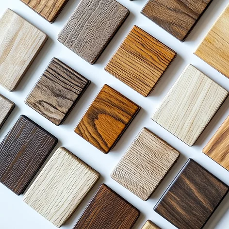
Here’s a little secret—before color visualization tools came along, picking an exterior shade often meant staring at tiny swatches under fluorescent lighting and hoping it looked the same in sunlight. (Spoiler: it rarely did.) Now, thanks to innovations like the JOINBLING color visualization tool, that guesswork is practically extinct. Tools like these let you input your postal code, select a main color, choose your building style, and preview the final look—sometimes even before the first nail hits the frame. You can save your palettes, share them with clients or your design team, and tweak endlessly until it feels just right. It’s like Photoshop for real life, but way more practical for construction pros, material buyers, and homeowners alike.
Here’s why that matters. Visualization tools do more than just make a project “look pretty on a screen.” They reduce indecision and accelerate decision-making in a way that feels almost magical—but it’s all grounded in data and experience. Instead of debating between “Arctic White” and “Soft Cream” for a week, you can see how each interacts with roof tiles, window trims, and even surrounding landscapes. For contractors, this means fewer change orders mid-build. For homeowners, it’s confidence—seeing exactly what they’re getting, without surprises. That’s customer confidence in action.
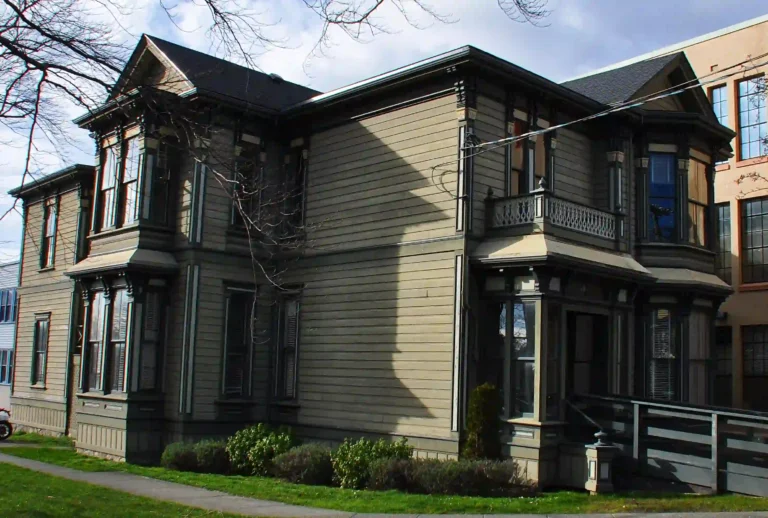
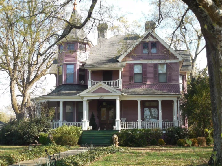
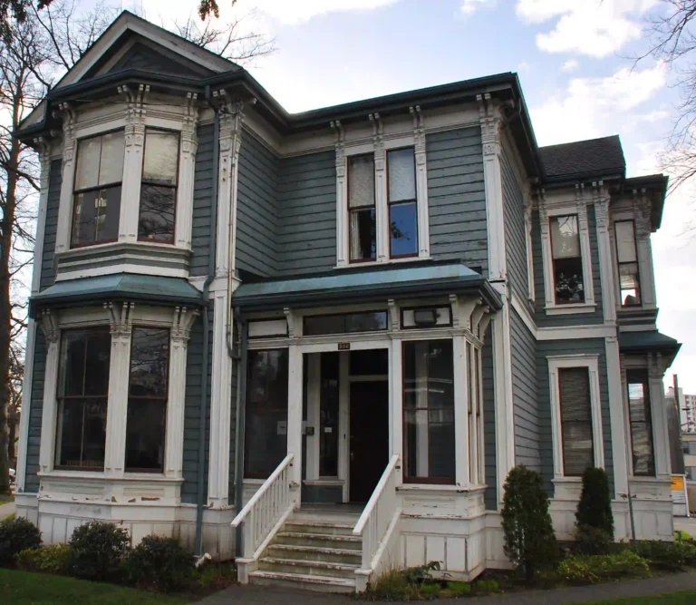
Now, let’s talk trends, because 2025 isn’t bringing timid neutrals. Deep, personalized colors are taking center stage: navy facades that feel bold but refined, grey tones that blend sophistication with versatility, and soft green shades that complement natural surroundings.These colors aren’t just about aesthetics—they signal durability and long-term investment in the home’s curb appeal. And when paired with low-maintenance, weather-resistant materials, these choices communicate quality before anyone even steps inside.
But here’s the catch—choosing the right shade still matters, even with advanced tools. Not all screens display colors accurately, and sunlight changes everything. That’s why tools like JOINBLING color visualization don’t just show static previews—they account for material textures, finish types, and sometimes even environmental factors like light exposure. It’s not perfect, but it’s a quantum leap over the old “swatch-on-the-wall” method.
So, let’s sum it up: modern color tools aren’t just for picking shades. They’re part of a bigger experience—helping homeowners, designers, and construction teams collaborate, make confident choices, and see potential issues before they become expensive problems. It’s facade design, powered by tech, with a human touch. And for JOINBLING facade projects with color tools, it’s quickly becoming a non-negotiable part of the process.
Here’s the thing—every construction pro knows the drill: color decisions can be deceptively complicated. You think it’s just “pick a shade,” and suddenly you’re juggling window trims, roof tiles, siding textures, and the inevitable “I thought it would look different” from the client. That’s exactly why JOINBLING adopted color visualization tools. The goal? Enhance client experience, slash decision-making time, and minimize costly rework. And spoiler: it works.
Let’s walk through a typical workflow, step by step, so you can see how a project goes from vague ideas to a fully visualized facade.
The benefits are real and measurable:
Shorter approval times – What used to take weeks of back-and-forth now happens in days.
Increased customer confidence – Clients see exactly what they’re getting, reducing anxiety and second-guessing.
Reduced errors and rework – Fewer surprises on-site means fewer costly fixes.
Let’s throw in a few numbers (based on JOINBLING project stats): projects using the visualization tool saw approval cycles cut by 60%, customer satisfaction scores jump by 25%, and rework due to color or material mismatches drop by nearly half. Even without citing exact client names, the trend is clear: the tool pays for itself many times over in efficiency and peace of mind.
Here’s the kicker: it’s not just about technology—it’s about trust. When clients interact with a tangible visualization of their future home, it builds confidence in the design, the materials, and, importantly, in JOINBLING itself. Exterior color selection stops being a gamble and starts being an enjoyable, collaborative process.
Alright, so you’ve seen the power of color visualization tools, but here’s the catch: they only work if you implement them thoughtfully. There’s more to it than just picking a tool and letting clients play with swatches. Let’s break down what really matters.
Tool selection and integration
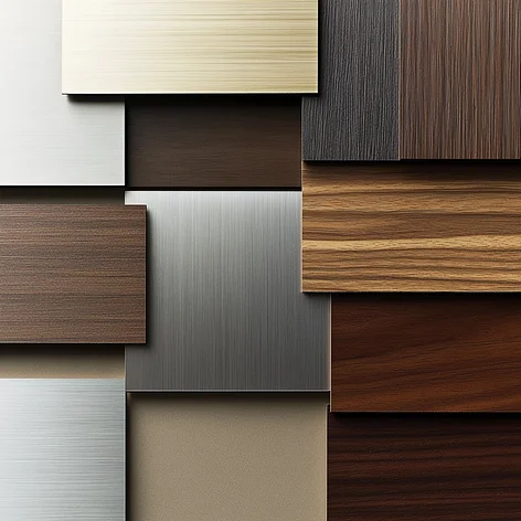
Not all visualization tools are created equal. You want one that supports postal code input, has style presets, offers a robust material library, and allows easy sharing functions. Why? Because a client’s palette shouldn’t just look pretty—it should be relevant to their environment, their building’s style, and practical constraints like local climate. A well-integrated tool keeps the workflow smooth for everyone: clients, designers, and contractors.
Color durability and material compatibility
Here’s where things get technical, but don’t worry—I’ll keep it digestible. When choosing exterior colors, consider UV exposure, local climate, and even fire-risk zones . A bright white might fade in a sunny area, or a dark hue could absorb heat and affect siding expansion. The right tool should account for material compatibility, helping clients see options that won’t just look good today but last for years.
Style recognition and color suggestions
Some tools, like the JOINBLING color visualization tool, go beyond swatches—they understand architecture. Input a modern, classic, or farmhouse style, and the system suggests colors that complement the style, rooflines, and accents . It’s like having a design-savvy assistant who never sleeps.
Customer involvement in decision-making
Nothing builds confidence like participation. Let clients save, share, and vote on palettes. Make it a collaborative process instead of a top-down mandate. When clients see their ideas reflected in the final plan, it reduces second-guessing and improves satisfaction.
Team coordination: design + construction alignment
This might be obvious, but it’s worth saying: a visualization tool is only as effective as the team using it. Designers and construction crews need to be aligned on the exact color codes, material types, and finishes. Miscommunication here can still lead to mismatched colors or material substitutions—a problem no tool can fully fix on its own.
Post-installation maintenance and brand consistency
Finally, think long-term. Encourage clients to document their color choices and palettes. This helps with future maintenance, extensions, or even resale. A consistent visual identity across projects doesn’t just look polished—it subtly reinforces the JOINBLING brand.
In short, the right visualization tool is a mix of tech and thoughtful human process. Ignore any of these factors, and even the fanciest tool can fall flat. Nail them all, and you’re giving clients a confident, collaborative, and surprisingly fun facade design experience.

Here’s something you don’t hear every day in construction: a company that treats design and service integration as equally important as the materials themselves. That’s JOINBLING. Unlike many suppliers who stop at “here’s your siding,” JOINBLING sees the bigger picture—facade design, client collaboration, and yes, even that little spark of excitement a homeowner gets when they finally see their color choices come to life.
So why did JOINBLING double down on color visualization tools? Let’s unpack the strategy.
Differentiation from competitors
Most companies still hand clients a physical swatch or a PDF of potential colors. Not exactly inspiring, right? By offering an intuitive digital tool that visualizes the final facade, JOINBLING immediately sets itself apart. It’s not just about colors—it’s about giving clients a taste of the finished product before construction even starts. That’s a competitive edge that resonates in today’s market.
Enhancing customer experience
Imagine you’re a homeowner, staring at a blank canvas of siding options. It’s overwhelming. The JOINBLING color visualization tool transforms that uncertainty into a guided, engaging experience. Clients can explore palettes, try bold or subtle combinations, and see how choices interact with windows, doors, and rooflines. This hands-on approach fosters customer confidence, reduces indecision, and makes the design process feel collaborative rather than transactional.
Strengthening brand value
Every project executed using this tool reinforces JOINBLING’s reputation for quality, innovation, and client-centric service. When a client feels in control and informed, they’re more likely to recommend JOINBLING to neighbors, friends, or contractors. Over time, that translates into a strong, recognizable brand presence.
Operational experience
The data backs it up. Projects using the visualization tool report faster decision-making, higher engagement, and fewer revisions on site. Contractors and designers spend less time chasing approvals, while clients feel confident and satisfied. It’s a win-win, and it creates a repeatable process that scales across projects.
Future roadmap
And JOINBLING isn’t stopping here. Plans are already in motion for AR/VR previews, allowing clients to “walk around” their future facades before a single board is installed. Community color sharing is next—think neighborhood palettes and inspiration libraries. And historical project palette libraries will let designers and clients reference past successes, speeding up decisions and sparking creativity.
Bottom line: JOINBLING doesn’t just adopt technology—it integrates it into the service experience. By doing so, they turn a potentially stressful facade design process into something exciting, collaborative, and surprisingly enjoyable. And honestly, that’s why they’re leading the pack.
Here’s the short answer to “How to use color visualization tools for facade design”: treat the color visualization tool as the project’s choreography—start with good inputs, let the tool do the heavy lifting, then lock down the details with real-world checks. (That first sentence — yes, that covers a lot.) If you’re a contractor, material buyer, distributor, or a homeowner working with JOINBLING, these steps will keep things smooth and predictable.
1,Preparation — get your house in the app
Photos: exterior shots from different angles (front, sides, close-ups of trim). Real photos = better previews.
Postal code / address: the tool can recommend palettes that suit local light, climate, and standard materials.
Building style & context: modern, classic, farmhouse — tell the tool what it’s working with (roof pitch, window styles, neighboring homes).
2,Tool usage — main color → palette → materials
Pick a main color first (this anchors everything).
Let the tool generate palettes and try those against photos. Toggle trim, door, and roof color layers.
Check material finishes: matte vs. semi-gloss vs. textured siding will read differently in sunlight.
3,Save & share
Export palettes, take screenshots, and share with the client, designer, and contractor.
Use team comments or voting features if available — let the homeowner, spouse, or project manager weigh in.
4,Pre-construction confirmation
Convert the chosen palette into an actual materials list with product codes and finish specs.
Confirm suppliers and lead times. Order samples if you’re unsure. (Samples are cheap insurance.)
Approve mock-ups or small sample panels on site if possible.
5,Post-construction documentation
Photograph the finished facade in daylight and dusk. Save the final palette and supplier info in the project file for future repairs, extensions, or resale.
Ignoring roof and window colors → mismatch. The roof and window frames are anchors; never treat siding color in isolation.
Choosing what “looks good on screen” without considering climate → dark colors in high-UV or hot climates can accelerate weathering or expansion. Consider moisture resistance and thermal behavior of the siding material.
Forgetting light variation → a color that looks soft in cloudy weather might read harsh in full sun. Always preview in multiple lighting conditions.
Leaving the client out of the process → if they haven’t participated, they’ll doubt the choice later. Let them click things. Let them veto. It’s cheaper than change orders.
Quick technical notes (because you asked for depth)
Moisture resistance: Choose materials with proven water-shedding detail and a compatible paint/finish system. Color won’t save you if the substrate traps moisture.
Load capacity & installation tips: heavier cladding needs proper fastening; some finishes require back-ventilation. Make sure the visual choice doesn’t force a different installation method that the crew isn’t ready for.
Finish selection: metallic or high-gloss finishes reflect differently; textured boards hide imperfections better than smooth boards
Q: “Do I still need physical samples?” — Yes. Always. Screens are great; samples are the final truth.
Q: “How many palette options should I present?” — Three solid options: conservative, bold, and safe-middle. Clients like choice, not paralysis.
Q: “What about maintenance?” — Darker colors can show fading and heat effects sooner; lighter colors hide dirt better but may show stains. Match color choice to maintenance expectations.
Wrap-up: use the JOINBLING color visualization tool (or a comparable system) as your intelligent ground-plan, not a magic wand. Combine its previews with on-the-ground checks — samples, supplier specs, and team alignment — and you’ll reduce rework, increase customer confidence, and deliver facades that look as good in real life as they did on the screen.
Here’s the short version: JOINBLING + color visualization tool + smart facade design = fewer surprises, happier clients, and stronger brand value. If you’ve read this far, you already know that good exterior color selection isn’t just decoration—it’s a strategic decision that affects durability, resale, maintenance, and most of all, customer confidence.
So what’s changed? Color visualization tools have moved from “nice-to-have” to core workflow. They let you preview real-world outcomes, coordinate teams, and catch issues before anyone shows up with paint buckets. Think of it as putting your project through a rehearsal before opening night—only the stakes are lower and the edits cheaper.
Wondering what’s next? Expect this to get cooler (literally and figuratively). AR/VR previews will let homeowners walk around future facades. AI-driven color recommendations will suggest palettes based on local climate data, neighborhood context, and even historical styles. Climate-adapted palettes—colors and materials chosen specifically for UV, humidity, or fire-risk zones—will become standard practice, not optional extras. In other words: more personalization, less risk, better outcomes.
Quick call to action: See your future facade before construction.
Try the visualization tool, save a palette, and share it with your designer and installer. That one simple step shifts the whole project from guesswork to confidence.
Three tiny next steps to actually make it happen:
Use the tool with real photos and your postal code. (Real inputs = real results.)
Export the palette and convert it into a materials list with product codes and supplier leads.
Schedule a quick alignment meeting—designer, contractor, homeowner—before ordering anything.
Last thought—don’t let technology replace human judgment. Use these tools to inform decisions, not to dictate them. They make the process faster and more reliable, but the best results still come from experienced pros making smart calls. If JOINBLING’s approach has shown us anything, it’s that the best outcomes combine tech, craft, and a little bit of taste.
Ready to stop guessing and start seeing? Go ahead—preview, pick, and proceed with confidence.
For further information, samples, and customized services, please contact joinbling, an excellent fiber cement supplier in China.